Monday, December 17, 2012

Visual Techniques

  • Harmony
  • Color
  • Asymmetric
  • Sharpness
  • Flatness
  • Exaggeration


Contrast
Monochrome
Symmetric
Diffusion
Depth
Understatement


Above are two posters from a kitchen utensils company: WMF and an automobiles company: BMW. By comparing and contrasting the differing results between the two design works produced by the different combinations of techniques, we can see that these two posters actually created by a polar-pair visual technique. In other words, the visual techniques that are applied on these two posters are opposite.

First, the scene in the WMF's poster is very harmony in color while the BMW's poster is in high contrast. For instance, the green and orange color of the carrot in WMF's poster creates a very agreeable and natural feeling. On the other hand, the dark gray BMW automobile appears in a white background creates a very strong contrast in color and tone.

Secondly, the composition of WMF's poster is asymmetrical while the composition of BMW's poster is (almost) symmetrical. This makes the BMW's poster well-balanced, yet the WMF's poster is still visually balanced.

Thirdly, The overall design of the WMF's poster is emphasizing on the sharpness and clearness of the image (product) in the poster while the BMW's poster is more promoting their automobile in a scene that obtains depth. The depth is created by the use of the diffusion visual technique.

Last but not least, The slogan of the WMF's poster: "Sharper than your think" and the image of the poster utilizes exaggeration technique. The image in the WMF's poster implies that their knife is so sharp that it will cut through the cutting board when user is cutting a carrot. Basically, It backs up the slogan that WMF's knifes are very sharp. On the other hand, the slogan and the image of the BMW's poster is relatively understated. It don't have a outstanding slogan or use exaggerated technique.


Monday, December 10, 2012

Contrast

An effective use of contrast

http://www.sleepyskunk.com/movieIdeas/view/?id=277

The use of contrast is contributing to the success of this Ghostbusters III movie poster. The contrast in this poster is operating in three main aspects: contrast in color, contrast in scale and contrast in shape. First, the utilize of the three primary color: red, black and white have a very intense contrast within one and other. The plain white ghost character and the red stop sign appear on the solid black background, which creates an obvious pop-out effect. This provides a particular zone of focal point to this poster, which catches viewers' attention and interest. Other than color, contrast in scale also plays an important role in the success of this poster. When we look at the poster as a whole, the ghost's HUGE three fingers hand sign also has a pop-out effect because of its unbalanced proportion. By comparing the size of ghost's hand to its size of body, we can realize that its fingers are totally out of proportion. This draws viewers' attention in order to indicate them that this is Ghostbusters "III" movie. Last but not least, the contrast in shape is also utilized in this poster, the "rounded" stop sign has a contrast to the "jagged"  fingers of the ghost, which adds extra contrast to this poster. Contrast not only effectively makes this poster stand out, but it also makes this poster rememberable!


A lack of or poor use of contrast

http://indulgy.com/post/er8vq3sr51/to-print-and-read-it-every-day

The lack of contrast is contributing to the failure of this poster. The reason why this is not a successful poster because it lack three main aspects of contrast: lack contrast in color, lack contrast in scale, and lack contrast in depth. First, it is lack contrast of color; the entire poster is using only one color, which is plain pink/purple. This does not provide a pop-out effect to be able to attract viewers' attentions. Secondly, it is lack contrast of scale. There is not any typographic hierarchy in this poster. The size of the front are in same style, and they are all uppercase. Since contrast is a relationship between two discourse segments. Therefore, if the contents of the poster do not have any contrast element, it will be very boring. Lastly, this poster is lack contrast in depth. As I mentioned, this poster is all covered by words without any space/room in between, which creates an extremely wordy and confusing feeling to its viewers. "Confusion and ambiguity are generally not effective in design or communication." In short, because of the lack use of contrast, this poster is a failed example of design.


Tuesday, December 4, 2012

Movement/Motion

http://www.flickr.com/photos/caz1958/4383207762/


The above image of Newton's collision balls apparatus is an example of implied motion in design. According to gestalt law of continuation, we expect lines to continue. Although it is a 2-dimensional graphic, the diagonal white curved-line swing from the right top corner to the left top corner indicates implied movement. In addition, this photo uses direction (curve derived  from circle shape) to convey the energy of rolling movement. Besides, blurred shadow is presented to indicate fast motion. lastly, the balls in variation of scale also communicate implied movement and sense of depth.


http://zachshaw.wordpress.com/page/2/


In this above graphic image, it contains the element of implied motion. The repeated  shadow is formed and blurred to imply the energy of movement  of the dancers. Even though the dancers are not actually dancing, their movement and elegant posture suggest the motion. This design conveys the energy of movement by using the gestalt law of continuation, which allow us to we expect that the patterns and lines to continue. In addition, the fact that the three groups of dancers are arranged to form a diagonal line also implies movement since diagonals communicate movement and change.


Tuesday, November 20, 2012

Dimension/Depth/Space/Scale


http://chroniclesofmouse.blogspot.com/2010_08_01_archive.html


    The utilization of dimension, depth, space and scale in the above Japanese movie poster is related to this week's material.  The poster is presented in linear perspective to represent three-dimensional space on a two dimensional media (surface). Although we cannot see a obvious parallel lines converge as they get further away in this poster, we can notice the use of linear perspective by observing the convergence of the buildings on both sides of the poster. In addition, the different scale of the human figures in this poster giving depth cues to the viewers. In other words, the injured man, who is laying on the floor has a relatively larger size than the man, who is standing behind him. Relative to its size, the depth of the space is evidently illustrated. Relative size is a depth cue, which indicates "objects that take up small part of the field of view are perceived as farther away than objects that take up large part of field of view." Furthermore, another depth cue - overlap is also utilized in this poster to show interposition. The horses overlap the buildings, which make the horses seems as being closer to the viewers. Last but not least, relative height is also a depth cue. The horizon line of this poster is located in the middle. Therefore, the man who is standing above the horizon line tends to seem as being further away.


Wednesday, November 14, 2012

Tone and Color


http://www.examiner.com/article/what-s-wrong-with-modern-movie-posters


  • How TONE is operating
In this movie poster, tone is operating a very important role. First, Tone allows viewers to recognize that it is a man portrait in this poster even though viewers can only see half of his face. Tones distinguish differences, changes and edges on a 2-D surface, which allows viewers to see the facial feature of the man. Without tone applying to this poster, viewers will not able to tell it is a human face. In addition, This poster has a high dynamic and tonal range, which provides more detail to be distinguished. Through seeing the strong differentiation of tones in this poster , viewers are able to see surface and form of the man's face.

  • How TONE is interacting
Tone is also interacting between the figure and the background. Tone has an abstract power to create mood. The dark and mysterious tone of the background combine with a cool and evil facial gesture of a man, provide a very heavy mood to the viewers. Tones are communicating and interacting within the entire poster to express a very secret feeling.

  • How COLOR is operating
Color is operating in this poster even though this poster utilizes a few colors only. The gold-yellow color of the iris around the man's pupil provides a high contrast to his thick black eyebrows above his eye, which create a strong focal point to the poster. Moreover, the white and pale color of the man's face also has a strong contrast to the deep blue black color of the background, which black and white is one of the "color-opponent" channels that emphasize differentiation.


  • How COLOR is interacting

Color is interacting with the objects within this poster. The deep red color of the man's lips is chosen to inspire deep human emotions. Dark red is associated with vigor, willpower, rage, anger, leadership, courage, longing, malice, and wrath. Therefore, the dark red color of the man's lip uses to interacts with the dark blue color of the jacket (the man wears) to create a very mysterious and heavy mood to the viewers.

Tuesday, November 6, 2012

The Basic Elements - Magazine design

Scale
http://www.americanthinker.com/blog/2008/08/another_magazine_cover_for_the.html


This magazine cover utilizes one the basic elements of visual communication: Scale. Scale is a general visual measuring tool that allows us to communicate actual scale and relative proportion.  By viewing this magazine cover as a whole, viewers will easily sense that the size of Obama's head is out of proportion in comparison to his body. This creates an emphasis effect and a focal point to the magazine cover. In addition, Scale also plays a leading role in typographic hierarchy. The slogan : "YES WE CAN'T" that is place in the lower center of the magazine cover catches viewers attention because of the use of large font. In short, Scale is one of the common elements that has always been adopted in magazine cover, for it can effectively stimulate our sense of rightness as well as draw our attentions.


Movement


http://bellyspin.wordpress.com/2012/08/06/magazines-movement-magazine-40/

Other than adopting scale as an element of design on the title of this magazine, this magazine cover utilizes another basic elements of visual communication: Movement. Movement is one of the most dominant visual forces in human experience, which has been commonly implemented in different media. Movement tends to imply motion and efficiently lead viewer's eye from one area to another. By briefly viewing this magazine cover, viewer's eye is directed to move from left to right direction because of the direction of the wave flow. The crest of the wave  unconsciously direct viewers' eye movement, which guides them to see the whole picture of the magazine. In summary, movement is one of the elements that interests viewers, which leads viewer's eye move from idea to idea.


Shape
http://www.monster-munch.com/monochrome-and-yellow/ 

The following magazine cover utilizes shape, which is also one the basic elements of visual communication. Two dimensional geometrical shapes, such as circle, square and square are commonly used in graphic media, for they are unambiguous shapes that represent cultural meanings and associations. For instance, circle usually means enclosure. In this above magazine,  there are two notable geometric shapes: a yellow circle and a white rectangle on the background. They combine together and provide a very outstanding focal point to this magazine cover. The yellow circle in the center of the magazine cover works as an enclosure, which "protect" and help emphasizing the contents (text) of the cover. In additions, the white (background ) rectangle makes the whole magazine cover looks static and solid. In conclusion, different shapes express different directions, associations, style or even period of time; therefore, shape is one the the useful basic elements of visual communication.


Tuesday, October 30, 2012

Visual Thinking Research Original Puzzle

1st Puzzle
Original Puzzle

My task to this 1st puzzles is to find two of the above three bracelets that are identical. First of all, I started by observing the bracelet on the left top corner of the puzzle (the one I box with dotted line) see figure below. By looking at this bracelet, I noticed that there are two red triangle that are pointing to each other (circled with purple line) see (1). Then, I decided to scan at the other two bracelets to see whether they have the same feature. Yes, the other two got the same. 

After that, I go back to the original bracelet and found out the other red triangle (boxed with yellow line) see (2). Then again I checked with the other two bracelets and realized that they also obtain the same feature. 


I did the same procedure as above on and on (see details below) until I discovered a different characteristic on the top right bracelet when compared with the other two. By looking closely to the top right bracelet, I found out that the (3) and (4) red triangle on this bracelet are facing opposite directions (circled with black line) See explanation in the gray area below. On the other hands, the other two bracelets both have the same direction (> >of red triangles on position (3) and (4), where each bracelet are circled with orange hexagon and green star unfilled shape.


In this specific puzzle game, I used one of the various visual thinking operations defined in the McKim reading, which is "matching". While I was working on this puzzle, I recognized and sought for the desired patterns as a whole and matching it.


*Note:  My father and I had a similar approach to this puzzle and exactly the same result as I did below; therefore, I think it's unnecessary to post his result doubly. Hope you can understand :)

2nd Puzzle
Original Puzzle

My task to this 2nd puzzles is to change the above illustration of rocking horse that made up of 5 shapes to become a fox by moving 2 of the shapes. First of all, I started by imagining what a fox look like. As I recalled, a fox's head should have an outstanding triangle ears. Therefore, I began to look for a shape that resembles fox's ears. I eventually found two triangle that seems like a pair of ears. Then, I moved on this direction. I decided to remove the shapes that are above the two triangle. After that, I rotated and moved around the two shapes and finally I created a face of a fox within 15 minutes. See details below


In this specific puzzle game, I used one of the various visual thinking operations defined in the McKim reading, which is "Closure". While I was working on this puzzle, my mind seems to complete the shape of a fox by itself. My brain unconsciously perceive the whole image by filling in the missing information.

*Note:  Even though my father needed to spend a bit longer time to figure out how to make the fox, we got the same result again.

Reference:
http://www.puzzles.com/PuzzlePlayground/Visual.htm


Wednesday, October 17, 2012

Visual Perception 2 / Feature Hierarchy

Picture taken from:
http://www.time.com/time/covers/0,16641,20070819,00.html


The above "TIME - Style & Design" magazine is related to this week’s topics, for it utilizes feature channel hierarchies: 
  • Shape / Size
  • Color
  • Spatial Layout

By viewing this "Time" magazine cover as a whole, we can see that the most eye-catching feature of the visual hierarchy with this magazine is the size. The title of the magazine: "TIME" has the largest font on this magazine, which makes the word visually pops-out the most on this cover. Therefore, viewers tend to draw their attention to it first.

Secondly, the red colored border of the magazine cover would definitely attract viewers' eye. The rectangle shape of the border works as a frame, which not only help holding and organizing information together on the cover, but it also helps to emphasize the photograph of the cover.

Thirdly, viewers will notice the black colored eyeglasses frame, for it has a high contrast with the skin-colored background. The black-colored glasses frame help lead reader's eye to focus on the center of the magazine. 

Last but not least, when the viewer is looking at the center of the magazine, they will be appealing to the deepness of the eye. Even though Color and shape tend to attract attention more readily, depth is also one of the most effective preattentive channels.

Eventually, viewer will scan down and read the small caption of the magazine to seek the detailed information about this magazine 

Wednesday, October 10, 2012

Visual Perception 1 / Top-Down Visual Processing

                                                                              Note: My goal-directed eye movements
"We Can Do It!" is an American wartime propaganda poster produced by J. Howard Miller in 1943.

"The poster was seen very little during World War II. It was rediscovered in the early 1980s and widely reproduced in many forms, often called "We Can Do It!" but also called "Rosie the Riveter" after the iconic figure of a strong female war production worker. The "We Can Do It!" image was used to promote feminism and other political issues beginning in the 1980s." (Taken from Wikipedia)

How it is related to this week’s topics?

This "We Can Do It!" poster is related to our topics, for it involves: 
  • Top-down visual processing
  • Goal-biased attentional looking 
  • Goal-directed eye movements.

How top-down visual processing operates in its design?

When I started looking this poster, the bold yellow and blue background attracted me, which was my response to "yellowness and Blueness" according to “Visual Queries” chapter from Colin Ware’s “Visual Thinking for Design.” Then, my attention was drawn to the top headline "We Can Do It!”, which are largest fonts in the poster. It catches my attention because of its size. (Top-down visual processing) Next, I wondered what is about "We can do it!" and I started getting interested to find out what the poster is about (Goal-biased attentional looking ). I scanned down and looked for details. I saw a female's face with a confident facial gesture. I moved on looking at her left hands and noticed that she is holding her sleeve and showing her bicep with her right fist closed, which implies that she is a strong women. I looked into the small details and discovered that there is a badge with an image of a female face on it, which is attached to the women's collar. I realized that this could be a poster that promotes feminism or something about women right. Therefore, I scanned down to the bottom of the poster to see the publisher information. (Goal-directed eye movements.) By studying the poster top-down, I successful found out the information that I wondered.

Work Cited


Wednesday, October 3, 2012

Design Success and Failure / Syntactical Guidelines


A SUCCESSFUL DESIGN
“Scratch my back” by Pinkeye

“Scratch my back” is an interesting grater, which was designed by Pinkeye – a team of Belgian designers, composed of Arnaud De Vicq, Bram De Baere, Luc Heylen, Ruud Belmans and Thomas Vanden Abeele.

Balance as Functionality
The four feet are providing a stable stance that allows for a practical use. The physical balance here is the result of a functional balance so that this grater can be operated safely and properly without making a mess. For instance, the firm and solid feet will avoid the grater from bending or shifting, thus, there will be no carrot / cheese grating all over the place, but just on the plate. 

Leveling
This “Scratch my back” grater achieves balance, stability and lack of tension and stress. Therefore it is a leveled product design that utilizes "Leveling" as one of the syntactical guidelines.

Positive and negative space
There are some negative space around and between this grater. This dome-shaped animal (porcupine) creates an arched negative shape under its belly, which adds an aesthetic perception to the entire design.


A FAILURE DESIGN
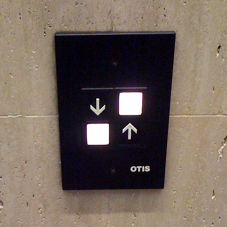
Buttons with adjacent descriptions
Elevator button design by OTIS

Balance as Functionality
Even though this elevator button is a symmetrically balanced design, the design doesn't meet the functional requirements. It is true that visual balance could be desirable; However, it is a huge failure when a product design is "visually" well-designed, but it is "physically" failing in its functionality. A design of elevator button should be simple and user-friendly, but this OTIS elevator bottom seems to create confusion and inconvenience to the users instead. Therefore, it is a failure design in terms of it functionality. 

Wednesday, September 26, 2012

Visual vs Symbolic Language


In this particular image, there is an aged military worn-out cap, which is in light brown color. The cover of the cap was probably made of hard leather. A golden badge is attached to the front of the cap. In addition, there is a couple of star badges with ribbon placed next to the military cap. Both the cap and the star badges are sitting on an American Flag, which becomes the background of the entire image. An American veteran in full uniform could be used as a replacement for this image.

  • Proud
  • Sacrificial
  • Honorable
  • Impressive
  • Unforgettable
  • Suffering
  • Peaceful

  • American Flag = Freedom
  • Military cap = War
  • Star badge with ribbon = Military honor

By seeing an image that has a combination of an American flag, a military cap and a star badge, American will immediately relate these three elements to our honorable veterans.

As an American, we should be thankful to those active duty military and returned veterans for their sacrifices that they and their families have made to make our country secure and peaceful. We should never ever forget what they have suffered and done for our country. In addition, all the veterans should be proud of themselves for their contribution.
     

Wednesday, September 19, 2012

Meaning 2: Interactions Between the 3 Levels of Meaning


Representational

By looking this painting as a whole, we can see that the gigantic watch, which is sitting on the beach, is the focal point of this piece of art. Watch is a representational object that people have seen and recognized from their daily life. A (detailed) realistic watch with an unusually size appears in a picture will definitely draw viewers' attention and curiosity. Viewers may doubt whether the picture is real. By leading viewers to think and guess, this painting will leave a deep impression on viewers’ mind and catch their interest to investigate into it more.


Abstract
 
In addition, other than representational, this painting also purposely utilized abstract level. As I mentioned, the irregular size of watch is an abstraction.  Even though the details of the watch are not minimized or deleted, the size of the watch itself is intentionally isolated and exaggerated. By showing a watch that is painting realistically, but  in abstract size , viewers will be confused. This allows viewers to have plenty of space for imagination and questions about the painting and for the artist.


 Symbol
 
Furthermore, by observing deeply into the two watch hands on the watch face, we can discover that having the watch hands at 10:10 is a recognizable symbol for every advertisement of watch brand. Watch companies tend to put their brand name above the center of the watch. By displaying both watch hands at 10:10 around the brand, the brand will be famed and not blocked by the hands. Hence, viewers will draw attention to the brand name.
Besides, the seven (or eight) sea gulls also symbolize the watch hands in this painting. The “V” shape flying posture of the sea gulls appears to denote the 10:10 position of the hands on watch’s face.  This creates an illusion to viewers and makes the entire painting more interesting and aesthetic!